Slobber & Chops
BACKGROUND
Slobber & Chops is a vibrant new dog salon nestled in Brighton’s beloved and eclectic Kemptown. It’s not just a grooming space but also a haven for dog lovers, featuring a well stocked retail space with everything a pup, and a pup owner, could ever need.
The salon and shop is the culmination of owner Sally’s dream of becoming a dog groomer. Inspired by her own dog, Betty—lovingly nicknamed Slobber Chops—Sally turned her passion into reality by gaining the right qualifications and opening her own brick-and-mortar business. Being asked to design this brand from the ground up was a dream, allowing me to shape the identity and strategy of this one-of-a-kind dog lover’s destination.
Solution
What made this project particularly interesting was the challenge of balancing a fresh, new brand identity with the trust and loyalty of an existing client base. With Slobber & Chops being a new venture for Sally, who was taking over from a previous dog salon, it was crucial to create a brand that felt exciting and new, yet still familiar and trustworthy for existing clients.
I dedicated time to understanding the audience, crafting detailed profiles to ensure the brand resonated with dog owners who needed to feel confident leaving their beloved pets in Sally’s care. The location of the shop also played a huge role in the strategy of the brand, with Kemptown being the home of Brighton’s precious and most loved LGBTQ+ community.
I felt that what stood at the heart of this brand was Community, Connections and Expertise which I crafted into their brand values. In order to represent this through the design, it was important to always show dog owners as much as the dogs themselves as the people are what makes this brilliant Brighton dog community so special. This is where I got to play with illustration in representing the many wonderful forms of dog owners through the branded character illustrations.
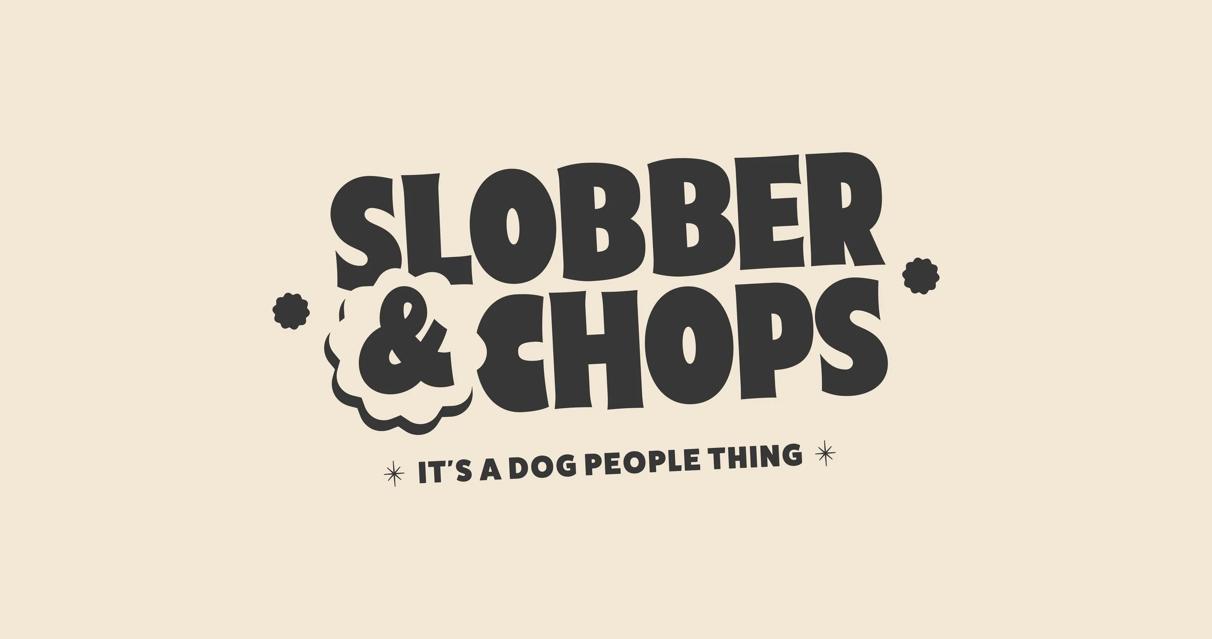
The ampersand in the logo design also took on a large part in representing the brand values. The bold ampersand is highlighted through the badge shape to visually join the dogs, community and people together, whilst the shape mimics rosettes used for dogs 'best in show' ribbons to illustrate the high quality care and expertise Slobber & Chops gives to all of their clients. I wanted the style to represent the traditional hardware stores classically seen in the 60's as they became hubs for local communities, but with a fresher take for today's modern dog market.
“Vicky has only gone and done it again. When I started a completely new career path becoming a Dog Groomer, it was always the dream on the horizon of having a brick and mortar shop & salon. And I knew immediately who would be able to help me with the task of creating a fresh new dog grooming brand in the busy Brighton scene. Vicky, as expected, has been so attentive and just 'got' my vision immediately - and wow did she deliver! Dare I say my shop front is now one of the best in Brighton?! - and it's all down to her detailed Branding Strategies and Design, from start to finish. It makes me sad that I can't just keep starting up new businesses, because I just love watching her process in creating something so special and personal to your vision. Vicky - you are genuinely the kindest, most talented soul ever, THANK YOU!”


